
Table of Contents
Contents
Welcome to this honest look at the Tips Blogger Template. The short answer is yes. Tips is a smart choice if you run a wellness coaching site or a health food education or small business blog and you want a homepage that works like a landing page. It gives you a hero banner and program cards and pricing plans and a post feed without any extra plugin. It is not the best fit for a fast news desk or a heavy video magazine.
If you like clean layouts with a simple structure you can also compare it with the Mogu Blogger Template before you decide. Both keep the focus on titles and images and readable content.
What the Tips Demo Actually Shows
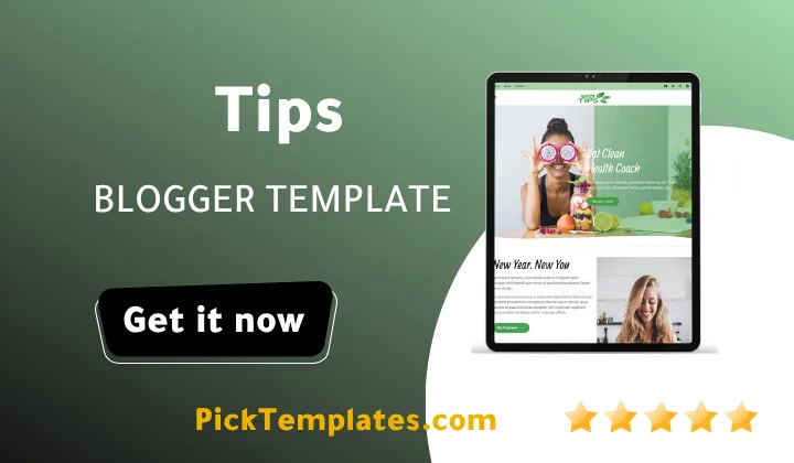
Many Blogger themes only show a post grid. Tips theme opens with a coach style homepage. The demo uses a yellow brand color and a bold hero area with two images and a call to action button. Below it you will find short program blocks and a pricing section before the recent posts even start.
Here is the order of sections I saw when I scrolled the demo from top to bottom. Each block can be replaced with your own text and images.
- A hero banner with a big headline and a short paragraph and a button that leads to your main service page.
- An about block with two images that introduces your program in a friendly way.
- Three service cards for topics such as weight loss and meal planning and detox.
- A pricing section with three plans and a highlight label for the most popular one.
- A recent posts grid with category labels and author name and date and a Read button.
- A Load More button that keeps the page light until the visitor asks for extra posts.
- A sidebar area with social links and subscribe video and popular posts and tags and categories.
All the demo text is placeholder text. The old post dates and the odd post links come from the demo content and not from the Tips Template itself. Replace them before you publish anything.
Why the Pricing Plans Block Matters for Coaches
This is the part that makes Tips different from a plain blog theme. A coach or a trainer or a course seller can show three clear plans on the homepage. The demo uses a beginner plan and a most popular plan and a full service plan. Visitors read the price and the list of benefits and click one button.
Practical tip. Keep your three plan names short and write each benefit as a single line. A visitor on a phone should understand every plan without scrolling sideways.
Remember that Blogger has no built in payment system. The register buttons only link to a page you choose. You can point them to a contact form or a payment link or a booking page from another service.
Navigation and the Mega Menu
The menu in the demo has a multi dropdown and a mega menu and links to a shortcodes page and an error page and a sitemap link. The documentation links are also included in the menu. That tells me the author wanted bloggers to see every menu style in one place.
For a larger site this is useful because you can group topics such as health and food and business under clear headings. Readers who prefer a more traditional magazine feel may also like the Quno Blogger Template as a second option.
Important note. The demo page has a viewport setting that blocks pinch zoom on phones. This can hurt accessibility for some readers. If you care about it you can edit that meta line in the theme code after you make a backup.
Setup Experience for Beginners
I always make a full backup before I upload any theme. With Tips the setup is simple once you follow the written documentation. A web guide and a video guide are both linked from the demo menu.
- Back up your current theme from the Blogger theme page before you upload the XML file.
- Upload the template and then open the Layout page to fill the homepage widgets one by one.
- Add labels to your posts first because the category and tag sections depend on them.
- Use square images with the same size for the post grid so the cards stay even.
- Create the About and Contact pages early because the top menu links point to them.
Take your time with the homepage widgets. A missing label or an empty widget can leave a gap in the layout and it is easy to miss on mobile.
Strengths That Stood Out
- The homepage feels like a real business site and not like a diary.
- The bright yellow accent gives the design a friendly and energetic mood.
- The layout stays clean because titles and images get most of the attention.
- Categories and tags and popular posts help readers move between articles.
- The template suits health and lifestyle and food and education and business topics.
These strengths matter most to beginners who want a professional look without paying a designer. They matter less if you only publish long essays with no services to sell.
Honest Weak Points
- Free users get no support so you must rely on the documentation and your own testing.
- The demo has only placeholder content so you cannot judge real article pages from it alone.
- The yellow color may clash with a brand that uses soft or dark colors unless you edit it.
- Blogger limits advanced features such as built in forms and memberships and payments.
- The zoom restriction in the viewport tag is a small accessibility problem.
None of these points is a deal breaker. They simply mean you should test the theme on a draft blog before you move your live site.
Practical tip. Run the free Google PageSpeed Insights test on your own blog after you add real images. Compress every picture before you upload it and your pages will feel much faster.
Who Should Skip It
If you plan a breaking news site with a ticker or a store with a cart then Tips theme is not the right tool. The same is true for a photo portfolio that needs a full screen gallery. Look for a theme built for those goals instead.
Available Versions
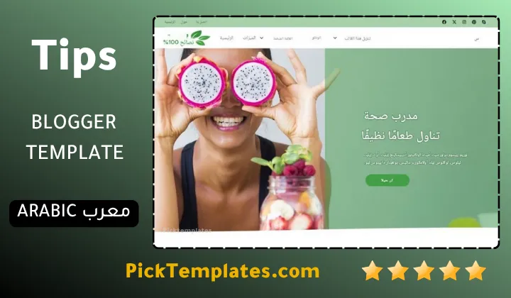
There is a free Arabic version that was localized by Picktemplates and it is protected by copyright. There is also a free English version that is protected by copyright. A paid English version also exists and it was created by the designer Way2themes who is the template author. Always keep the footer credit in the free versions.
You can browse more options in the magazine Blogger templates category if you want to compare styles before you choose.
Information
| Template Name | Tips |
| Version | 1.0.0 |
| Creation Date | 04 October 2026 |
| Last Update | 06 October 2026 |
| Platform | Blogger |
| Author | Way2themes |
Features
- Clean and modern design built for Blogger
- Landing page style homepage with a hero banner
- Ready made program and service blocks
- Three column pricing plans section
- Recent posts grid with category labels
- Load More button for lighter first loading
- Popular posts and most popular widgets
- Featured post and random posts sections
- Categories and tags widgets for easy discovery
- Multi dropdown menu and mega menu
- Built in shortcodes page for content styling
- Social plugin and social links in several places
- Subscribe area with video embed support
- Custom error page for broken links
- Responsive layout for phones and tablets
- Web documentation and video documentation
Conclusion
Tips is a practical Blogger theme for people who want a clean and friendly website with a strong homepage. Its hero banner and pricing plans and post grid work well for wellness and health and education and small business blogs. The simple layout keeps readers focused on your content.
It is not perfect. Free users get no support and the demo only uses placeholder content. The zoom setting and the bright yellow color may need small edits. If you can accept those limits then Tips gives you a lot of value for a free theme.
Expert opinion from Mouhssine Boukou with 10 years of experience. I would choose Tips for a coach or a small service blog that needs a professional first impression fast. I would not choose it for a news site or a heavy media magazine. Always test it on a draft blog and replace every placeholder with your own text and compressed images before you go live.
We have localized the free version of the Tips template into Arabic and fixed the Right-to-Left (RTL) layout issues to make it easier to use on Arabic blogs.