
Table of Contents
Contents
Welcome if you have been comparing Blogger themes for a magazine style blog, Neoblog blogger template is one of the names that keeps coming up. The short answer is that it earns that attention through a genuinely strong grid based homepage and a wide set of built in widgets, while it still asks a fair bit of patience from anyone setting it up for the first time.
Before anything else it helps to know that this theme circulates in three separate forms right now. There is the original free release which stays protected by copyright and should not be resold or rebranded under another name. There is a limited free Arabic localized build produced by Picktemplates for readers who prefer working in an Arabic dashboard. And there is the complete free and paid English release built and maintained directly by the original designer at SoraTemplates. If your project leans toward a lighter editorial layout instead, a theme such as SEO Flex follows a more minimal structure that is worth comparing before you commit to Neoblog.
The Grid Layout and Visual Presentation of Neoblog
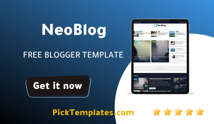
Neoblog is built around a magazine grid rather than a simple vertical feed, and that choice shapes almost everything else about how it feels to browse. The homepage opens with a hero block that rotates a handful of featured posts, then breaks into a masonry style arrangement of thumbnails sized according to category importance. Larger cards go to whichever section the site owner marks as a priority, while smaller cards fill the surrounding grid with recent posts from other categories.
Hero Section and Featured Post Display
The hero area doubles as the featured post widget, and it is one of the stronger parts of the theme. Thumbnails load in a fixed aspect ratio so the top of the page stays visually consistent even when writers upload images of very different sizes. Text overlays sit on a semi transparent bar rather than directly on the photo, which keeps headlines readable over busy images without the site owner needing to edit every cover photo by hand.
Widget Variety Across the Homepage
Where Neoblog theme really shows its magazine roots is in the widget count. A single homepage can combine several of the following sections without feeling like a wall of unrelated boxes.
- Newsticker widget that scrolls short highlights near the top of the page
- Hot Post widget that surfaces trending articles based on recent traffic
- Featured Post widget used for the rotating hero slider
- Custom category widgets that let each section keep its own visual style
Each of these widgets can be dragged into different layout zones from the theme layout panel, so a food blog and a tech blog running the same theme rarely end up looking identical.
Content Types That Fit This Layout Best
The grid rewards sites that already publish across more than one topic. Tech blogs mixing reviews and news, movie and entertainment coverage, food criticism, and recipe collections all tend to benefit from the way Neoblog separates categories visually, since each section can keep its own color accent inside the same overall layout. A single topic blog with only one or two categories will still work, but a lot of the grid space ends up repeating the same category tag, which makes the homepage feel repetitive rather than varied.
Where the Design Shows Its Age
Not every part of the visual language has aged at the same pace. The default typography leans on heavier drop shadows and rounded card corners that were common in magazine themes several years ago, and it can look slightly busy next to newer minimal designs. Site owners who want a cleaner and quieter grid sometimes look at Median UI instead, which trims the same magazine idea down to fewer visual layers. It is also worth remembering that Google has treated loading speed as a ranking signal for years through its Core Web Vitals guidance, so a busier homepage with many widgets is not just a style choice, it is something worth testing on a real device before launch.
A practical tip worth following early on is to disable two or three of the homepage widgets before publishing your first posts, since an empty Hot Post or Newsticker section looks emptier on a magazine grid than it would on a simple blog layout.
Always keep a backup of your current theme XML file before restoring a new one in Blogger, since switching themes replaces widget placements and any custom gadget positions you had configured.
Setting Up the Theme Without Losing Your Existing Layout
Installing Neoblog template follows the same general process as most custom Blogger themes, though a few steps matter more than others once the widget count grows this high.
- Download the theme file in XML format from the official source
- Open the Blogger dashboard and select Theme from the left menu
- Click the small arrow next to the Customize button
- Choose Restore and upload the downloaded XML file
- Rebuild the widget layout using the layout panel once the theme is active
The full documentation from the original author walks through the widget specific settings in more depth, and it is worth reading in full at least once rather than guessing at the settings panel labels.
Pros and Cons After Spending Real Time in the Layout Panel
No magazine theme fits every project equally well, and Neoblog is no exception. The strongest points tend to show up once a site has enough content to fill the grid properly.
- Wide widget selection covers news, hot posts and featured stories without extra plugins
- Grid based homepage handles multi category sites more gracefully than a single feed layout
- Layout panel allows non technical site owners to rearrange sections without editing code
- Built in AMP support and mobile responsiveness reduce the need for separate mobile tweaks
Together these points make the theme genuinely competitive for anyone running a busy multi writer magazine rather than a single topic blog. The weaker points are less about function and more about how much setup time the theme expects from a new user.
- The number of widgets can overwhelm a first time Blogger user during setup
- Some visual elements feel dated next to newer minimal magazine themes
- Free support is limited, so troubleshooting often relies on community documentation
None of these points rule the theme out, but they do mean it suits someone willing to spend an afternoon configuring widgets rather than someone who wants a five minute setup.
Neoblog earns its place among the more capable free blogger templates built for magazine style Blogger sites, particularly for multi category sites that need a grid rather than a plain list of posts. If the Neoblog theme does not turn out to be the right visual fit once you see it running on your own content, the wider magazine template collection covers several other grid based options worth comparing.
Information
| Template Name | Neoblog |
| Version | 1.0.0 |
| Creation Date | 28 March 2023 |
| Last Update | 28 March 2023 |
| Platform | Blogger / Blogspot |
| Author | Soratemplates |
Features
- How To Setup Neoblog Blogger Theme
- Fully responsive layout that adjusts smoothly across phones tablets and desktops
- Multiple homepage widgets such as Newsticker and Hot Post sections
- Featured post slider for highlighting top stories at the very top of the homepage
- Drag and drop style layout panel for arranging widgets without touching code
- Mega menu and drop down navigation built for large content libraries
- Breadcrumb navigation that keeps readers oriented inside deep categories
- AMP support aimed at faster loading mobile pages
- Retina ready graphics tuned for high resolution screens
- Social bookmark integration for quick sharing across networks
- WhatsApp sharing button built directly into post pages
- Slideshow widget available for the homepage header area
- SEO friendly on page coding structure aimed at better indexing
- Footer options with both three column and two column layouts
- Multiple color skins including black, blue and white variations
- Ads ready layout with dedicated slots for banner placements
Conclusion
Neoblog Blogger Template is best suited to writers and small teams who already have enough content to justify a magazine grid, rather than someone launching a brand new single topic blog with only a handful of posts. The widget system is the real reason to choose it over a simpler theme, since it lets a news style site, a review site or a lifestyle magazine organize very different kinds of posts on one homepage without hiring a developer.
Anyone installing it for the first time should budget real setup time for the layout panel, read the official documentation before touching the widget settings, and keep a backup of the current theme before restoring Neoblog over it. The free version is a fair starting point, and upgrading to the paid release from SoraTemplates only makes sense once the extra widgets and support actually get used.
Expert opinion by Mouhssine Boukou, who has ten years of experience working with Blogger themes, is that Neoblog remains a solid pick for a multi category magazine in 2026, but it is not the theme to choose if speed and visual minimalism matter more to a project than widget variety. Newer, lighter magazine themes will load faster out of the box, and Neoblog only holds its own once its extra widgets are trimmed down to what a site actually needs.
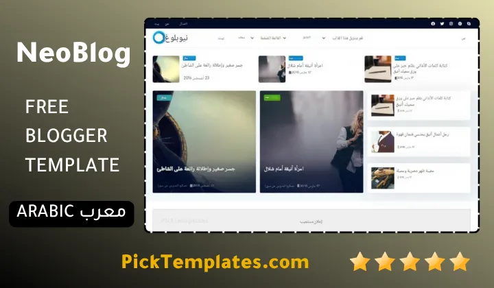
We have localized the free version of the NeoBlog template into Arabic and fixed the Right-to-Left (RTL) layout issues to make it easier to use on Arabic blogs.