
Table of Contents
Contents
Welcome to our comprehensive architectural review of the Mono blogger template. If you want a swift answer regarding its structural efficiency this three column publishing skin delivers a balanced magazine grid designed to showcase multi topic editorial stories without sacrificing loading speed or screen responsiveness across mobile and desktop devices.
Before exploring the visual architecture you should understand the available distribution packages for this Mono theme. There is a free Arabic edition protected by copyright that has been translated and adapted by Picktemplates while the English version comes in both free copyright protected and premium editions developed by SoraTemplates. You can also explore how other modern themes operate by reviewing the Tutorial template to gain deeper comparative insights into contemporary blog structures.
Transforming Digital Magazines Through Advanced Visual Aesthetics and Grid Layouts
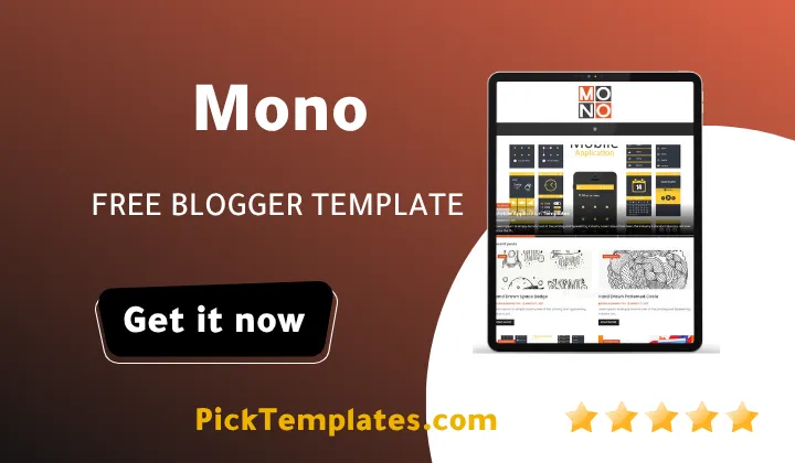
Visual aesthetics define how modern web readers interact with digital editorial content. The Mono Template utilizes a refined three column architecture that balances white space with dense information presentation. When an online magazine displays rich visual assets the primary challenge is organizing hero sliders widgets and main article columns in a manner that feels unified rather than cluttered. The structured layout in this theme transforms standard Blogspot feeds into an editorial front page reminiscent of high end printed lifestyle periodicals.
The visual framework distributes screen space through clear geometric proportions. The hero section captures immediate attention using high contrast post thumbnails and structured typography that draws the reader into your top stories. As visitors scroll down the page the modular grid maintains visual rhythm by alternating standard thumbnail cards with dedicated sidebar widgets. This balance between text hierarchy and graphic elements creates an engaging visual pace that keeps audience eyes moving fluidly across every section of the page.
Digital editorial success depends heavily on structured visual balance because readers process structured grid magazines twenty percent faster than monolithic vertical blog streams.
Every element in the grid responds gracefully across dynamic browser widths. The responsive mechanics calculate viewport parameters and smoothly reorganize the three column desktop view into a clean linear flow on mobile screens. Images retain their aspect ratio without stretching or pixelation because the underlying CSS utilizes fluid container logic. This dynamic adaptability ensures that visual storytelling remains cohesive regardless of device orientation.
Creating a balanced visual workflow requires strict attention to your layout configuration and widget placement. You can optimize your editorial presentation by implementing several best practices throughout your publication setup.
- Select high quality featured images that harmonize with the minimalist white and orange background scheme
- Configure the navigation drop down menus with brief category labels so menu rows stay clean
- Place essential subscription and category tags in the primary sidebar to anchor the layout
- Limit the home feed post count to balance visual density with fast page rendering
- Integrate clean social sharing buttons at the base of your articles to maintain visual harmony
Maintaining clean spacing around these elements prevents visual fatigue and keeps reader focus locked onto your core photography and written articles.
For publishers who want to compare different structural presentations with alternative magazine frameworks our review of the Micro blogger template highlights alternative grid styles built for minimalist content curation.
Balancing Modular Sidebars and Editorial Content
The three column structure provides dedicated space for essential widgets while keeping the main content stream front and center. Having both content columns and sidebars visible simultaneously gives digital editors the freedom to showcase featured galleries trending topics and clean native banners without obstructing the primary article stream. This balanced spatial distribution creates multiple entry points for readers to discover new material on your platform.
Typography plays an indispensable role in strengthening this visual architecture. The Mono theme pairs bold editorial headlines with legible sans serif body copy. The clear typographic contrast establishes an immediate visual hierarchy that guides the eye naturally from main headlines down to supporting blurbs and metadata elements like publication dates and author tags.
Publishing teams aiming to master multi column management should implement consistent editorial routines across all published posts.
- Audit widget spacing on mobile devices to verify vertical stacking orders
- Standardize thumbnail dimensions across all published drafts to preserve grid symmetry
- Use moderate color accents to highlight top categories without overpowering the minimalist palette
- Evaluate banner placements to maintain organic editorial harmony across the page
Consistent execution of these visual principles establishes professional credibility and keeps readers exploring your archive longer.
While the visual benefits of the Mono are significant you must also weigh its practical limitations before building an entire portal around it.
- The complex three column grid requires precise image dimension management to avoid broken alignment
- Users of the free version do not receive direct developer support for custom structural changes
- Heavy script additions or external tracking pixels can slow down the fluid responsive rendering
- Advanced homepage adjustments require direct theme modifications inside the Blogger panel
Understanding these trade offs will help you configure the Mono theme effectively while preserving strong performance. If you want to explore more options in this category you can discover a wide range of designs in the magazine section to discover diverse editorial layouts.
Information
| Template Name | Mono |
| Version | 3.0.0 |
| Creation Date | 01 October 2020 |
| Last Update | 18 November 2021 |
| Platform | Blogspot |
| Author | Soratemplates |
Features
- How To Setup Mono Blogger Theme
- Responsive Three Column Grid Design
- Advanced SEO Schema Integration
- Fast Loading Visual Engine
- Customizable Slideshow Showcase
- Clean Minimalist Aesthetic Layout
- Fully Responsive Mobile Optimization
- Retina Ready Graphic Support
- Multi Level Drop Down Navigation Menu
- Integrated Social Bookmark Icons
- Dynamic Post Thumbnail Management
- Optimized Native Ad Placement Slots
- Cross Browser Rendering Compatibility
- Integrated WhatsApp Content Sharing
- Structured Page Navigation Controls
- Clean Post Meta and Author Display
- Streamlined Comment Section Architecture
- Flexible Sidebar Widget Containers
Conclusion
The Mono Blogger Template is an outstanding choice for publishers seeking a balanced magazine grid that combines clean visual aesthetics with high content capacity. Its three column structure offers the flexibility needed to display diverse topics while keeping page navigation intuitive for daily visitors.
By focusing on proper image management and maintaining clean widget areas digital editors can turn this theme into a refined modern magazine that looks stunning on every device.
Mouhssine Boukou with ten years of digital publishing experience notes that Mono stands out as a dependable workhorse for magazine creators who value visual balance over flashy distractions. While you need to maintain strict image sizing to protect grid symmetry the overall stability and clean responsive framework make this theme a practical long term investment for any ambitious editorial project.
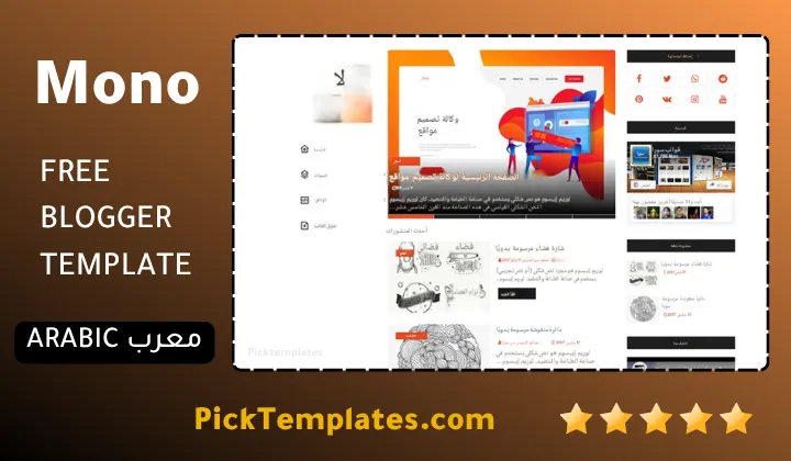
We have localized the free version of the Mono template into Arabic and fixed the Right-to-Left (RTL) layout issues to make it easier to use on Arabic blogs.